EMPOWERING EDUCATORS AT
COPENHAGEN BUSINESS SCHOOL
COPENHAGEN BUSINESS SCHOOL

Traditionally, accessibility has been approached as accommodation for the needs of students with disabilities. Students with a hearing impairment would require access to captions/transcript to make use of a video lecture. Students who are color blind would not be able to access messages conveyed through different colors (e.g. in annotations). Such accommodation was understood primarily as a necessary condition for these students’ engagement with course material and ultimately their learning success.
Today, accessibility is increasingly seen as a valuable enabler for many more groups of students and the focus has shifted to building it into course design (e.g. through the application of Universal Design for Learning, UDL) rather than offering it as an add-on. Accessibility features, such as captioned/transcribed videos can be easier to access for non-native speakers or for those studying in shared spaces where audio is not an option. Using higher contrast colors and less text in slides makes it easier to see for the students sitting in the back row of a lecture hall. Here, accessibility is defined by ‘ease of access’.
Teaching & Learning endorses the view that accessibility should be seen as a benefit for all students rather than a few select groups. To support this, we have put together two brief guides to creating accessible teaching materials. You can find them below together with further details on each recommendation.
Universal Design for Learning
Universal Design for Learning (UDL) is a framework to improve and optimize teaching and learning for all based on scientific insights into how humans learn. If you want to know more, you can find further information here: https://udlguidelines.cast.org/.
– Making your PowerPoint presentation more accessible (link)
– Making your videos more accessible (link)
– How to download Assist (
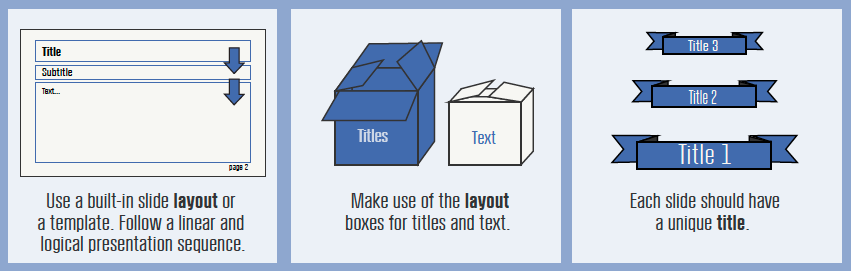
The consistent layout is particularly important for students relying on assistive technology, such as screen readers. The easiest way to achieve this is by using one of the recommended templates (CBS template). If not using a template, ensure that the presentation is compatible with screen readers by running the presentation through the Assist tool.
Remember:
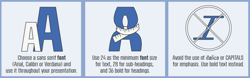
For students with dyslexia, the fonts that are used in a presentation can be crucial to enable – or hinder – their engagement with the content. It is estimated that up to 7% of the population has been diagnosed with dyslexia (Peterson, Robin L.; Pennington, Bruce F. (May 2012). “Developmental dyslexia”. Lancet. 379 (9830): 1997–2007. doi:10.1016/S0140-6736(12)60198-6).
To make your presentation accessible for them, pay attention to the font you use, its size, and its purpose.
Remember:
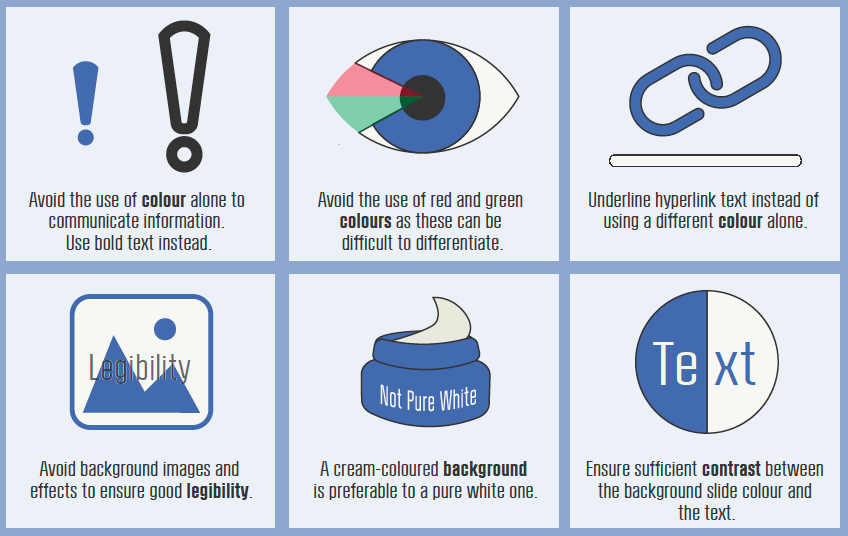
There are two accessibility issues related to the choice of color:
Some people are unable to perceive color differences or may not perceive color the same way you do. Therefore, it is important to avoid using color alone to communicate information. For example, if the link text is blue, it should also be underlined so students who are unable to perceive color differences can distinguish links from surrounding text. Do not use color as the only indicator of meaning, such as marking priority items in red.
Some students may have difficulty perceiving text if there is too little contrast between foreground and background. To create the best experience for your readers, ensure that
The W3C Web Content Accessibility Guidelines 2.0 require that color combinations meet clearly defined contrast ratios. To meet the guidelines at Level AA, text or images of text must have a contrast ratio of at least 4.5:1 (or 3:1 for large text). Several free tools have been developed that make it easy to check color combinations for WCAG 2.0 compliance, such as Colour Contrast Analyser (for Windows or Mac) (https://www.tpgi.com/color-contrast-checker/) and WebAIM Color Contrast Checker (https://webaim.org/resources/contrastchecker/ ).
Remember:
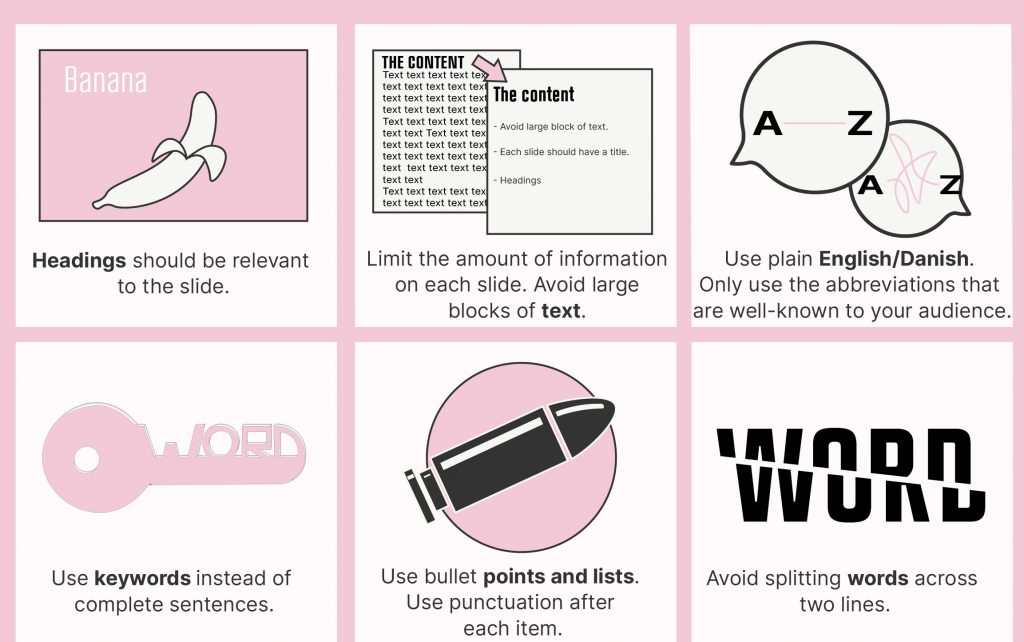
A presentation that has a clear structure and a limited amount of information on each slide is easier to read for all, but it is particularly important for neurodiverse students (e.g. those with Dyslexia, ADHD, Autism).
To avoid overwhelming the students, minimize the amount of text on each slide and avoid long sentences. Try to make it easy for learners to identify the main points – bullet points make slides easier to follow as well as help students rely on assistive technology, such as screen readers. If you find yourself putting a lot of text on a slide, consider providing this information as a separate file instead.
Remember:

The use of images and multimedia in presentations supports student learning by offering multiple channels of engaging with the course material, which is especially valuable for neurodiverse students. At the same time, these students are highly susceptible to the sensory overload that can be triggered, for example, by animations and sounds that are not immediately relevant to the content of the presentation.
When using images or graphs, it is also necessary to consider the needs of students with visual impairment. To provide text descriptions, right-click on ‘Image’, select ‘format picture’, click the third icon along and select ‘alt text’ and then add in the title and description and click ‘OK’.
‘Click here’ to mark a hyperlink may show action, but this has been shown to slow down screen readers and increase cognitive load for their users. Instead, try to use descriptive hyperlinks that explain more clearly what information they link to.
Captions and transcripts must be available for all multimedia elements to ensure audio content is accessible to students with a hearing impairment. They also help non-native speakers, neurodiverse students who process information better if presented in multiple modes (sound and text), students who are unfamiliar with the vocabulary used in the video, students who have the sound turned off on their devices, and students in noisy environments who are unable to hear the sound from their devices. Also, captions make it possible for users to search the video and can be repurposed as an interactive transcript so users can jump directly to particular points in the video from the transcript text.
Remember
The Slide Rules
Mads Højlyng has written an article on how to teach with slides and set up slides in your PowerPoint presentation. The article is from 2017, and you can read it here.
When preparing the material for your video, keep it simple. A lot of different layouts and colors can be overwhelming for the viewer. Bright colors attract the eyes and may result in the loss of focus on your material.
Some students have difficulty perceiving text if there is too little contrast between foreground and background. Ensure that there is a strong contrast between the text and the background, for example, dark text on a pastel or cream background (not white). Try to avoid contrasting colors such as red and green as these colors can be difficult for color-blind students to differentiate.
Help students identify the key information. Bullet points keep it simple and make it easy to follow the video, especially if you have a voice-over.
If using annotations, plan what and where you want to annotate in advance to not waste time and cause confusion. The video runs smoothly and is easy to follow if there are no hesitations.
Remember:
Poor audio and video quality can impact students’ ability to understand you and can decrease engagement. It can also cause unnecessary distraction and a sensory overload for neurodiverse students, especially in the case of an echo or scratching.
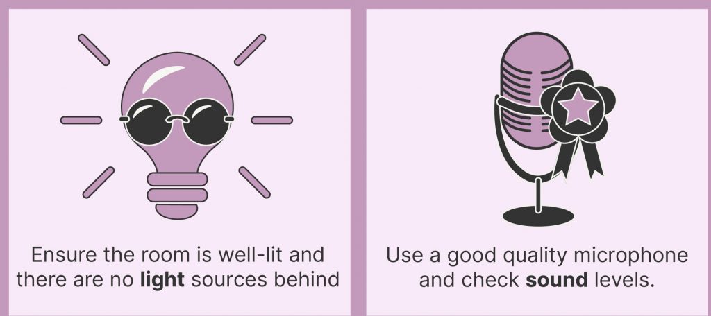
To ensure good sound quality:
Some students use mouth movements to help them understand spoken language. When feasible, ensure that the speaker’s face is visible and in good light. The best way to make sure that you are well lit is to have your light source come from behind the camera. At the very least, try to make sure your light source isn’t behind you.
Remember:
When choosing whether to include the video stream of yourself when recording your lecture, consider if the footage of you adds meaning or personal connection to the lecture video. If you are going to include a talking head, be sure to face the camera and maintain eye contact. When the footage of you distracts from the lecture video, it is better to exclude it from the recording. For example, if you’re sharing a dynamic process on your screen, your presence can distract from the moving parts and the meaning of your recording, and create a sensory overload.
If making the recording yourself, prepare your setting to minimize the visual noise – choose a plain background, declutter the space around you and be mindful of the contrast between the color of your background and your clothing.
Speak clearly and avoid speaking too fast. Pause between topics and give your students time to process information.
Neurodiverse students in particular can struggle to keep focus if the narration is done in a monotonous voice and no other means of engaging with content are provided. When using a talking head / full body recording, use hand gestures/body movements to keep the viewers’ attention.
As with all types of multimedia, captions and transcripts are critically important for many groups of students with known disabilities but can ultimately benefit all viewers.
Remember: